Viewport
<meta name=”viewport” content=”width=device=width,initial-scale=1″>
The viewport meta tag :
- Ensures that the screen width is set to the device width and the content is rendered with this width in mind
- Designing the websites to be responsive to the size of the viewport
- Bootstrap grid system
Bootstrap grid
Designed to be:
- Responsive
- Mobile first
- Fluid
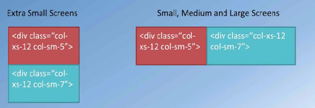
– Bootstrap makes available four classes
- xs for extra small
- sm for small
- md for medium
- lg for large screen sizes
– Each row in Bootstrap grid system is divided into 12 columns
– Use the classes .col-xs-*, .col-sm-*, .col-md-*, .col-lg-* for defining the layouts for the – various screen sizes
– Specify how many columns each piece of content will occupy within a row, all adding up to 12 or multiple thereof.
Bootstrap grid detail
Bootstrap grid detail
Using column classes
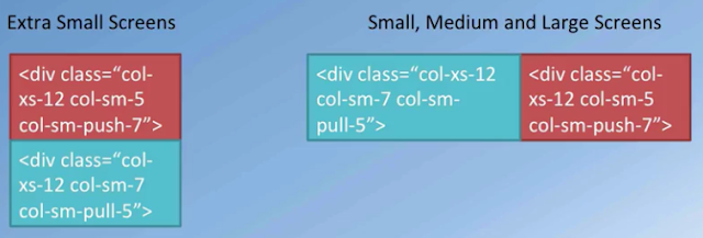
Using column push and pull
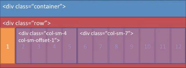
Column offsets
Nesting columns

